My favorite part about scrapbooking is that there is no right or wrong; this is true about many art forms. If there is a tendency to be perfect, release that now. If there is a tendency to be the best, release that too. Examine your motive to make a scrapbook, and aim to meet that goal. If the goal is to preserve memories, you’re at a good starting place.
Most people scrapbook photographs, so we will assume for this article that is what is being preserved. Other things often found in scrapbooks are news clippings, ticket stubs, notes, paper awards, etc. Preserve any memory you cherish!
Some basic materials you’ll need to get started are cardstock or decorative papers, adhesive, writing utensil(s), objects being preserved, and scissors.
 Those are the basic supplies, but many people find other products useful as well, which will be discussed later.
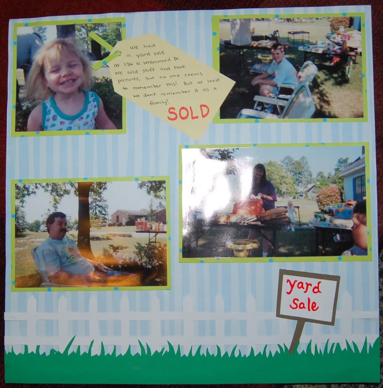
 For this spread, I used only patterned scrapbook paper (colored blue to represent sky) and solid scrapbook paper to design my own grass and fence. For the "sales tag" I used a basic shape offered through my own photo processing software. A design for such a tag may easily be downloaded for free. I even made the yard sale sign by my own hand.
It is important to use acid-free, lignin-free materials because this preserves your memories longer by keeping them from fading. Acid and lignin degrade paper because of their pH levels. Even acid-free paper may eventually become acidic.
Keep your priorities in order: know first what size spread you plan to create. A spread is two pages that face each other; a page is a single page facing. The advantage of creating a spread over a page is that you have more room for photographs, embellishments, and creativity. What size are your pages? The most popular sizes are 8x8”, 8.5x11”, and 12x12”. There are other sizes available.
One tip that will prove useful is to lay the page out before you actually begin piecing materials together. Either draw the layout on a blank sheet of notebook or typing paper, or lay out your materials and place them without adhering them. Envision what you want the final spread to look like. Keep this in mind as you “work” but be flexible; it may be that not everything you envisioned will work in your favor, and you may need to make some alterations to the original design.
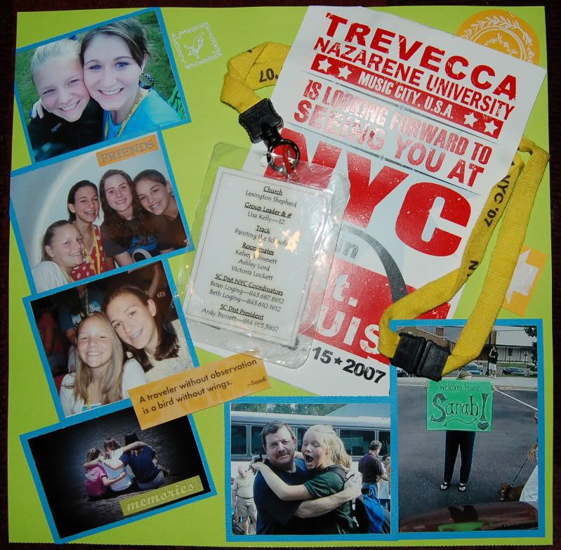 With the spread on the right (only one page of a two-page spread), I had many non-photo materials that were requested to be included in the spread. Only by laying them on the page and moving them around to various locations was I able to devise a way to fit them all on the spread to highlight the keywords and determine the size I could use for the photos.
Not everyone envisions the layout first. Play it by ear, if you are comfortable with that method. You can still create a wonderful, creative page this way; most people find it easier to design first so they may include and be prepared for all the materials they need.
Many people pack up their scrapbooks here. They cannot think of a layout that is “creative enough.” Let’s reset the bar here: “creative enough” should be according to your own standard. You have seen your friends’ scrapbooks and they overflow with brilliance and nostalgia. Do not compare your scrapbook to theirs! No one is the same, and this is not a competition. Stay focused on the goal: preserving your own memories. This is for no one else but you.
If you stumble over creating a layout for the spread, start simple. Begin by placing the photos on the page, side by side. If there is not enough room to lay them all side by side, place the remaining ones above or below the others. While you do this, think of the other materials you might use or other things you want to include. Lay those things on the page as well. Move the objects around until you come up with a design that best suits you.
Another tip that will really bring the page together is to match the paper and embellishments used to the objects being scrapbooked. You might match colors, or you may consider choosing themed paper. For example, if you are scrapbooking your husband’s softball game, look for paper with baseballs, baseball bats, baseball gloves, etc. You might try to find such unique stickers as a scoreboard or bleachers.
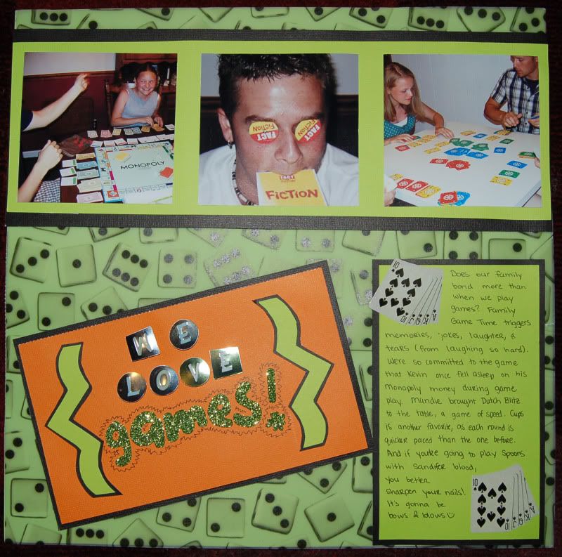
For this spread, I used die patterned vellum and layed it over simple lime green paper. I used game themed stickers to add simple embellishment.
It is at this point that a lot of my contacts that feel less creative lose steam. They cannot think of what embellishments to use to accent the photos and the spread. Though I’ve explained with an example, let me say it this way: think of the common theme in the photos, think of the actual intangible memory you are preserving by scrapbooking the photos, and think of the emotion this brings forth in you.
Emotion is often linked with color. Part of scrapbooking is touching the heart of another through nonverbal communication, and one way of expressing that in art is with color. By focusing on the emotion and the intangible memory, you will be able to visualize what icons correspond with those things. Perhaps baseballs and baseball gloves are too cliché for your taste; maybe what really takes you back to that memorable softball game is the smell and taste of the hot dogs and nachos you ate during the game.
 Try to find stickers of the hot dogs and nachos! This memory is coming from you, so let the benchmarks of the memory speak for themselves (as hot dogs and nachos usually do!). Match the colors of your embellishments, use colors often associated with softball, or design your own color scheme.
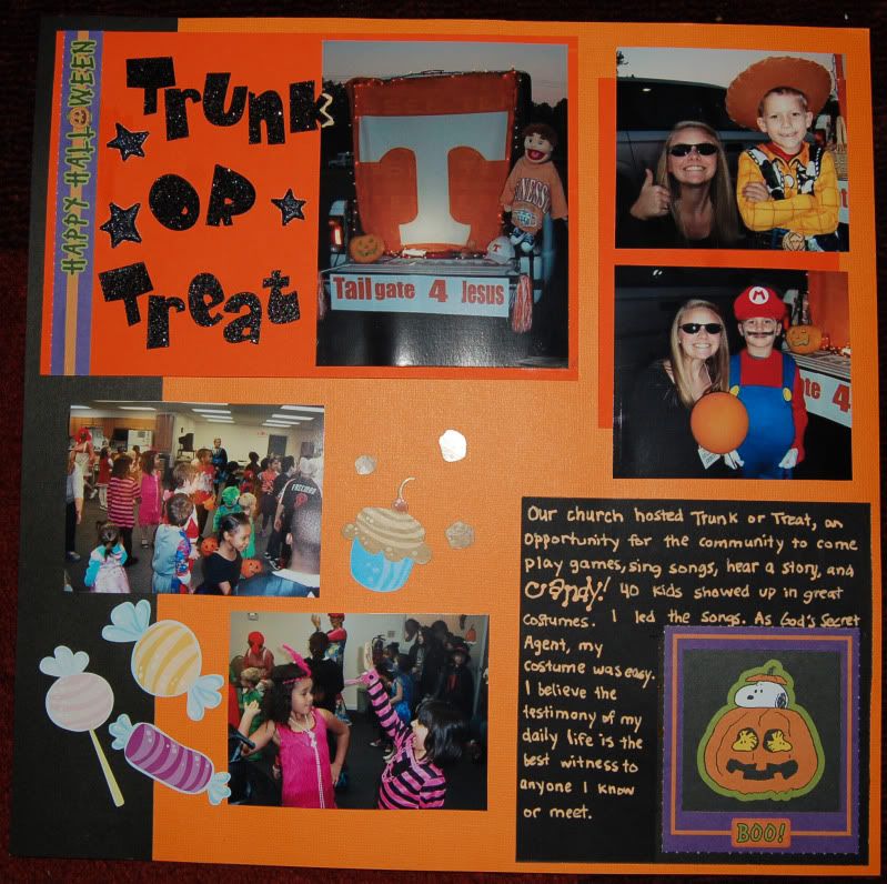
Note in the spread on the right, the candy stickers pertain to trick-or-treating, and the sparkly lettering stickers correlate to the "mystery" of Halloween. I used orange and black paper, as these colors are the colors most commonly associated with Halloween.
The basic objects of every spread are a title, a journal, and photos. You don’t have to journal. You don’t have to title. These are things that simply link one part of the spread to the next and keep the eye moving over the contents.
 Lead the viewer’s mind by placing key objects at “points” on the spread and connect those points. Anything not along the roadmap of the spread may be overlooked, but can often enhance the spread by standing alone.
If you feel you’ve hit the “Writer’s Block” of scrapbooking and all creative juices have been used, simply sit back for a moment, even a day. Allow your subconscious to continue working on the spread while you do other things. Come back to it refreshed.
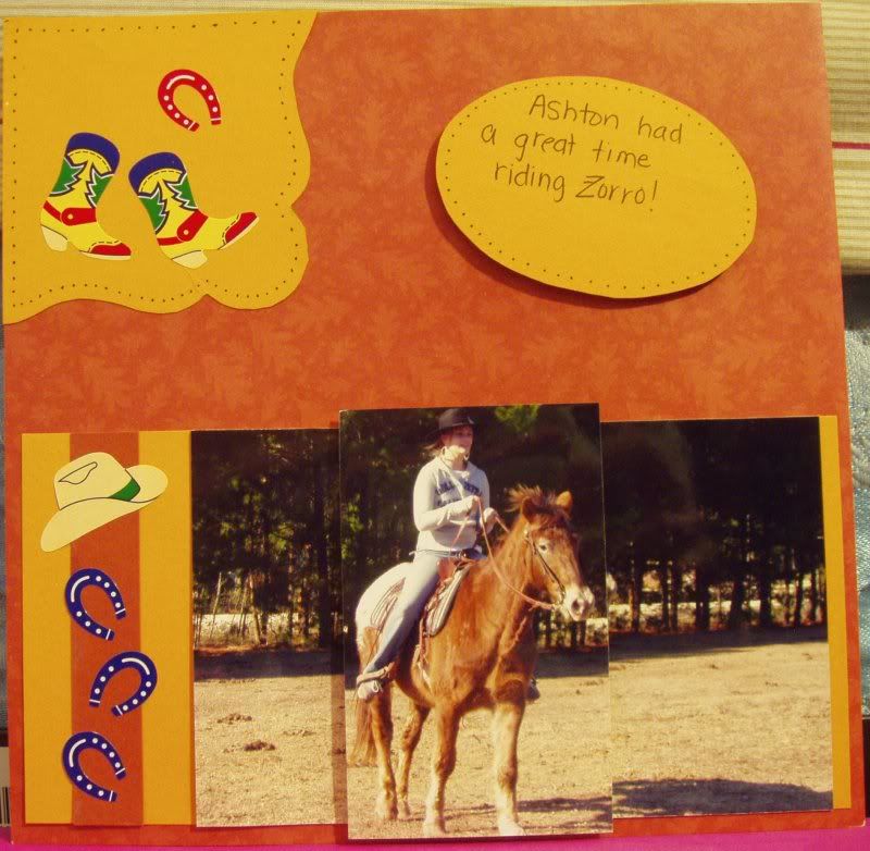
This spread of the horse and rider is a good example of raised layering. To raise the subject of the photo, I required two of the same photo. One photo I cropped the height at top and bottom so it would be just smaller than the central focus. The other photo I cropped the width to focus on the horse and rider. You may create your own lifts as described in the next paragraph or purchase adhesive squares, which are already thick enough to raise the photo.
One final tip: layer! Layering is very simple: take an object, apply it to paper, cut that out, and apply that to the spread. You might also consider raising an object or two on the page to add depth by using thick adhesive squares.
 If this product is unavailable to you, cut a thin strip of paper and fan fold it until it is a small square. Glue all folds until you have a solidified unit of folded paper. Now just use this as a spacer by applying glue to both sides.
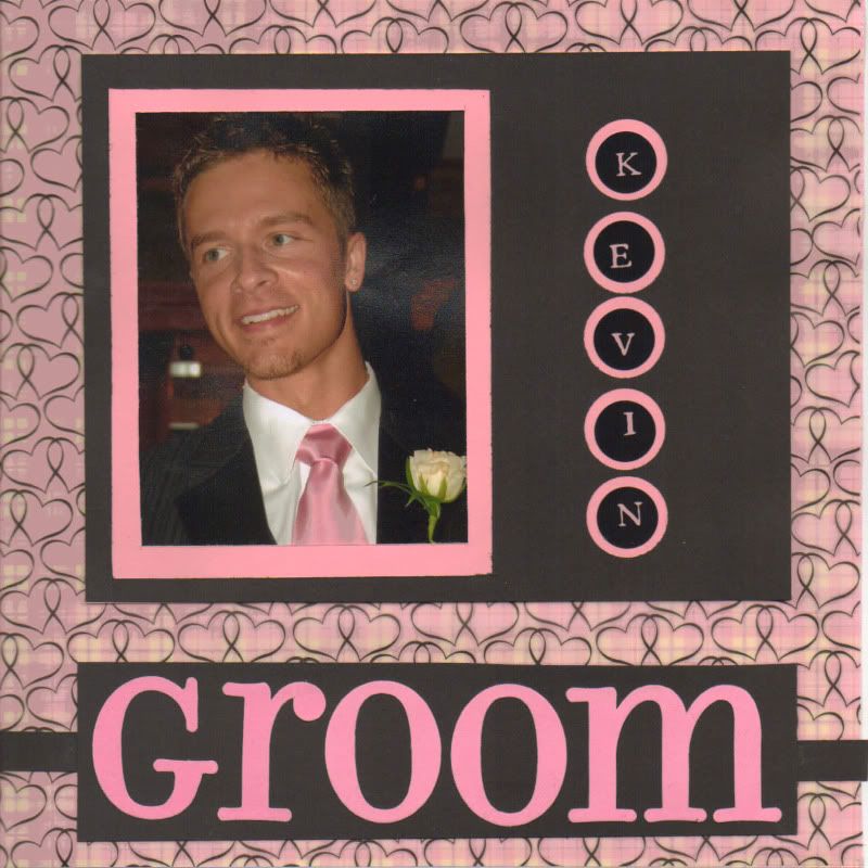
Notice the simplicity of this spread of the groom. As this spread was part of an album, the word "groom" was able to serve as both the title and the journal since other spreads clarified information about the groom. Not every spread requires complexity as is often seen in modern scrapbooking. The frame was made by marking on a template first, using a punch for the circles, and cutting the square with an exacto knife. I adhered the letters and photo to a sheet of pink cardstock, sized perfectly to rest behind the frame. The black frame was then adhered to the pink paper. This is a great example of layering. When making frames, I recommend creating a template first so changes can be made as necessary prior to using the paper meant for the spread (rather than for waste).
Now that you have some basic guidelines and tips, I hope you have the inspiration to think of creative ideas for displaying your photos and memories. Think outside the box, try new things, and above all, have fun!